CSS和CSS3速查
柠栀 2020/8/31 CSS
# CSS和CSS3速查
# 🕊第一部分:常用布局
# 🔥1.flex布局
基本概念:

- 🔥flex-direction(决定主轴方向):row | row-reverse | column | column-reverse;
- row(默认值):主轴为水平方向,起点在左端。
- row-reverse:主轴为水平方向,起点在右端。
- column:主轴为垂直方向,起点在上沿。
- column-reverse:主轴为垂直方向,起点在下沿
- 🔥justify-content(项目在主轴上的对齐方式):flex-start | flex-end | center | space-between | space-around;
- flex-start(默认值):左对齐
- flex-end:右对齐
- center: 居中
- space-between:两端对齐,项目之间的间隔都相等。
- space-around:每个项目两侧的间隔相等。所以,项目之间的间隔比项目与边框的间隔大一倍
- 🔥align-items(项目在交叉轴上如何对齐):flex-start | flex-end | center | baseline | stretch;
- flex-start:交叉轴的起点对齐。
- flex-end:交叉轴的终点对齐。
- center:交叉轴的中点对齐。
- baseline: 项目的第一行文字的基线对齐。
- stretch(默认值):如果项目未设置高度或设为auto,将占满整个容器的高度
- 更多访问 (opens new window)
# 2.网格布局
# 3.圣杯布局
# 4.双飞翼布局
# 5.清除浮动(float)
<div class="clearfix">
  <div class="floated">float a</div>
  <div class="floated">float b</div>
  <div class="floated">float c</div>
</div>
1
2
3
4
5
2
3
4
5
.clearfix::after {
  content: '';
  display: block;
  clear: both;
}
.floated {
  float: left;
}
1
2
3
4
5
6
7
8
2
3
4
5
6
7
8
效果展示
# 6.子盒子撑开父盒子,让父盒子的高随内容自适应
height: auto
1
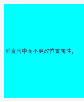
# 7.将元素垂直居中于另一个元素
<div class="ghost-trick">
  <div class="ghosting"><p>Vertically centered without changing the position property.</p></div>
</div>
1
2
3
2
3
.ghosting {
  height: 300px;
  background: #0ff;
}
.ghosting:before {
  content: '';
  display: inline-block;
  height: 100%;
  vertical-align: middle;
}
p {
  display: inline-block;
  vertical-align: middle;
}
1
2
3
4
5
6
7
8
9
10
11
12
13
14
2
3
4
5
6
7
8
9
10
11
12
13
14
# 8.恒定宽高比
<div class="constant-width-to-height-ratio"></div>
1
.constant-width-to-height-ratio {
  background: #333;
  width: 50%;
}
.constant-width-to-height-ratio::before {
  content: '';
  padding-top: 100%;
  float: left;
}
.constant-width-to-height-ratio::after {
  content: '';
  display: block;
  clear: both;
}
1
2
3
4
5
6
7
8
9
10
11
12
13
14
2
3
4
5
6
7
8
9
10
11
12
13
14
# 🐑第二部分:常用样式
# 1.重置样式
reset.css
/* http://meyerweb.com/eric/tools/css/reset/
   v2.0 | 20110126
   License: none (public domain)
*/

html, body, div, span, applet, object, iframe,
h1, h2, h3, h4, h5, h6, p, blockquote, pre,
a, abbr, acronym, address, big, cite, code,
del, dfn, em, img, ins, kbd, q, s, samp,
small, strike, strong, sub, sup, tt, var,
b, u, i, center,
dl, dt, dd, ol, ul, li,
fieldset, form, label, legend,
table, caption, tbody, tfoot, thead, tr, th, td,
article, aside, canvas, details, embed,
figure, figcaption, footer, header, hgroup,
menu, nav, output, ruby, section, summary,
time, mark, audio, video {
	margin: 0;
	padding: 0;
	border: 0;
	font-size: 100%;
	font: inherit;
	vertical-align: baseline;
}
/* HTML5 display-role reset for older browsers */
article, aside, details, figcaption, figure,
footer, header, hgroup, menu, nav, section {
	display: block;
}
body {
	line-height: 1;
}
ol, ul {
	list-style: none;
}
blockquote, q {
	quotes: none;
}
blockquote:before, blockquote:after,
q:before, q:after {
	content: '';
	content: none;
}
table {
	border-collapse: collapse;
	border-spacing: 0;
}
1
2
3
4
5
6
7
8
9
10
11
12
13
14
15
16
17
18
19
20
21
22
23
24
25
26
27
28
29
30
31
32
33
34
35
36
37
38
39
40
41
42
43
44
45
46
47
48
2
3
4
5
6
7
8
9
10
11
12
13
14
15
16
17
18
19
20
21
22
23
24
25
26
27
28
29
30
31
32
33
34
35
36
37
38
39
40
41
42
43
44
45
46
47
48
normalize.css
内容太多不复制了,查看这个粘贴吧 (opens new window)
# 2.创建加载动画
加载动画一
<div class="bouncing-loader">
  <div></div>
  <div></div>
  <div></div>
</div>
1
2
3
4
5
2
3
4
5
@keyframes bouncing-loader {
  to {
    opacity: 0.1;
    transform: translate3d(0, -1rem, 0);
  }
}
.bouncing-loader {
  display: flex;
  justify-content: center;
}
.bouncing-loader > div {
  width: 1rem;
  height: 1rem;
  margin: 3rem 0.2rem;
  background: #8385aa;
  border-radius: 50%;
  animation: bouncing-loader 0.6s infinite alternate;
}
.bouncing-loader > div:nth-child(2) {
  animation-delay: 0.2s;
}
.bouncing-loader > div:nth-child(3) {
  animation-delay: 0.4s;
}
1
2
3
4
5
6
7
8
9
10
11
12
13
14
15
16
17
18
19
20
21
22
23
24
2
3
4
5
6
7
8
9
10
11
12
13
14
15
16
17
18
19
20
21
22
23
24
效果演示
加载动画二
<div class="donut"></div>
1
@keyframes donut-spin {
  0% {
    transform: rotate(0deg);
  }
  100% {
    transform: rotate(360deg);
  }
}
.donut {
  display: inline-block;
  border: 4px solid rgba(0, 0, 0, 0.1);
  border-left-color: #7983ff;
  border-radius: 50%;
  width: 30px;
  height: 30px;
  animation: donut-spin 1.2s linear infinite;
}
1
2
3
4
5
6
7
8
9
10
11
12
13
14
15
16
17
2
3
4
5
6
7
8
9
10
11
12
13
14
15
16
17
效果展示

# 3.按钮边框动画
<div class="button-border"><button class="button">Submit</button></div>
1
.button {
  background-color: #c47135;
  border: none;
  color: #ffffff;
  outline: none;
  padding: 12px 40px 10px;
  position: relative;
}
.button:before,
.button:after {
  border: 0 solid transparent;
  transition: all 0.25s;
  content: '';
  height: 24px;
  position: absolute;
  width: 24px;
}
.button:before {
  border-top: 2px solid #c47135;
  left: 0px;
  top: -5px;
}
.button:after {
  border-bottom: 2px solid #c47135;
  bottom: -5px;
  right: 0px;
}
.button:hover {
  background-color: #c47135;
}
.button:hover:before,
.button:hover:after {
  height: 100%;
  width: 100%;
}
1
2
3
4
5
6
7
8
9
10
11
12
13
14
15
16
17
18
19
20
21
22
23
24
25
26
27
28
29
30
31
32
33
34
35
2
3
4
5
6
7
8
9
10
11
12
13
14
15
16
17
18
19
20
21
22
23
24
25
26
27
28
29
30
31
32
33
34
35
效果演示
# 4.使用CSS创建图形
圆形
<div class="circle"></div>
1
.circle {
  border-radius: 50%;
  width: 2rem;
  height: 2rem;
  background: #333;
}
1
2
3
4
5
6
2
3
4
5
6
效果演示

三角形
<div class="triangle"></div>
1
.triangle {
  width: 0;
  height: 0;
  border-top: 20px solid #333;
  border-left: 20px solid transparent;
  border-right: 20px solid transparent;
}
1
2
3
4
5
6
7
2
3
4
5
6
7

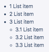
# 5.li标签计数器
<ul>
  <li>List item</li>
  <li>List item</li>
  <li>
    List item
    <ul>
      <li>List item</li>
      <li>List item</li>
      <li>List item</li>
    </ul>
  </li>
</ul>
1
2
3
4
5
6
7
8
9
10
11
12
2
3
4
5
6
7
8
9
10
11
12
ul {
  counter-reset: counter;
}
li::before {
  counter-increment: counter;
  content: counters(counter, '.') ' ';
}
1
2
3
4
5
6
7
2
3
4
5
6
7
效果展示
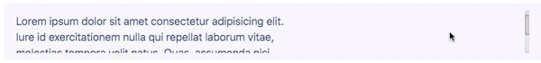
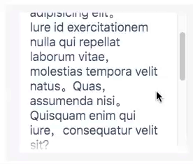
# 6.自定义滚动条
<div class="custom-scrollbar">
  <p>
    Lorem ipsum dolor sit amet consectetur adipisicing elit.<br />
    Iure id exercitationem nulla qui repellat laborum vitae, <br />
    molestias tempora velit natus. Quas, assumenda nisi. <br />
    Quisquam enim qui iure, consequatur velit sit?
  </p>
</div>
1
2
3
4
5
6
7
8
2
3
4
5
6
7
8
.custom-scrollbar {
  height: 70px;
  overflow-y: scroll;
}
/* To style the document scrollbar, remove `.custom-scrollbar` */
.custom-scrollbar::-webkit-scrollbar {
  width: 8px;
}
.custom-scrollbar::-webkit-scrollbar-track {
  box-shadow: inset 0 0 6px rgba(0, 0, 0, 0.3);
  border-radius: 10px;
}
.custom-scrollbar::-webkit-scrollbar-thumb {
  border-radius: 10px;
  box-shadow: inset 0 0 6px rgba(0, 0, 0, 0.5);
}
1
2
3
4
5
6
7
8
9
10
11
12
13
14
15
16
2
3
4
5
6
7
8
9
10
11
12
13
14
15
16
效果展示
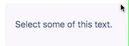
# 7.自定义文本选择效果
<p class="custom-text-selection">Select some of this text.</p>
1
::selection {
  background: aquamarine;
  color: black;
}
.custom-text-selection::selection {
  background: deeppink;
  color: white;
}
1
2
3
4
5
6
7
8
2
3
4
5
6
7
8
效果展示
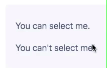
# 8.使文本内容无法被选择
<p>You can select me.</p>
<p class="unselectable">You can't select me!</p>
1
2
2
.unselectable {
  user-select: none;
}
1
2
3
2
3
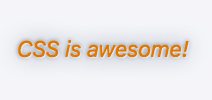
# 9.自定义变量
<p class="custom-variables">CSS is awesome!</p>
1
:root {
  /* 在此处放置变量以全局使用变量. */
}
.custom-variables {
  --some-color: #da7800;
  --some-keyword: italic;
  --some-size: 1.25em;
  --some-complex-value: 1px 1px 2px whitesmoke, 0 0 1em slategray, 0 0 0.2em slategray;
  color: var(--some-color);
  font-size: var(--some-size);
  font-style: var(--some-keyword);
  text-shadow: var(--some-complex-value);
}
1
2
3
4
5
6
7
8
9
10
11
12
13
2
3
4
5
6
7
8
9
10
11
12
13
效果展示
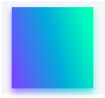
# 10.动态阴影(基于元素本身颜色的阴影)
<div class="dynamic-shadow"></div>
1
.dynamic-shadow {
  position: relative;
  width: 10rem;
  height: 10rem;
  background: linear-gradient(75deg, #6d78ff, #00ffb8);
  z-index: 1;
}
.dynamic-shadow::after {
  content: '';
  width: 100%;
  height: 100%;
  position: absolute;
  background: inherit;
  top: 0.5rem;
  filter: blur(0.4rem);
  opacity: 0.7;
  z-index: -1;
}
1
2
3
4
5
6
7
8
9
10
11
12
13
14
15
16
17
18
2
3
4
5
6
7
8
9
10
11
12
13
14
15
16
17
18
效果展示
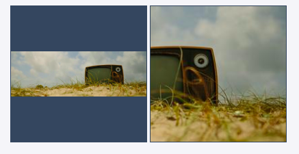
# 11.在容器中合适的展示图像
更改图像在其容器内的适合度和位置,同时保留其纵横比。以前只能使用背景图像和background-size属性。
<img class="image image-contain" src="https://picsum.photos/600/200" />
<img class="image image-cover" src="https://picsum.photos/600/200" />
1
2
2
.image {
  background: #34495e;
  border: 1px solid #34495e;
  width: 200px;
  height: 200px;
}
.image-contain {
  object-fit: contain;
  object-position: center;
}
.image-cover {
  object-fit: cover;
  object-position: right top;
}
1
2
3
4
5
6
7
8
9
10
11
12
13
14
2
3
4
5
6
7
8
9
10
11
12
13
14
效果展示
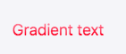
# 12.渐变文字
<p class="gradient-text">Gradient text</p>
1
.gradient-text {
  background: -webkit-linear-gradient(pink, red);
  -webkit-text-fill-color: transparent;
  -webkit-background-clip: text;
}
1
2
3
4
5
2
3
4
5
效果展示
# 13.悬停效果动画
悬停阴影框动画
<p class="hover-shadow-box-animation">Box it!</p>
1
.hover-shadow-box-animation {
  display: inline-block;
  vertical-align: middle;
  transform: perspective(1px) translateZ(0);
  box-shadow: 0 0 1px transparent;
  margin: 10px;
  transition-duration: 0.3s;
  transition-property: box-shadow, transform;
}
.hover-shadow-box-animation:hover,
.hover-shadow-box-animation:focus,
.hover-shadow-box-animation:active {
  box-shadow: 1px 10px 10px -10px rgba(0, 0, 24, 0.5);
  transform: scale(1.2);
}
1
2
3
4
5
6
7
8
9
10
11
12
13
14
15
2
3
4
5
6
7
8
9
10
11
12
13
14
15
效果展示

悬停下划线动画
<p class="hover-underline-animation">Hover this text to see the effect!</p>
1
.hover-underline-animation {
  display: inline-block;
  position: relative;
  color: #0087ca;
}
.hover-underline-animation::after {
  content: '';
  position: absolute;
  width: 100%;
  transform: scaleX(0);
  height: 2px;
  bottom: 0;
  left: 0;
  background-color: #0087ca;
  transform-origin: bottom right;
  transition: transform 0.25s ease-out;
}
.hover-underline-animation:hover::after {
  transform: scaleX(1);
  transform-origin: bottom left;
}
1
2
3
4
5
6
7
8
9
10
11
12
13
14
15
16
17
18
19
20
21
2
3
4
5
6
7
8
9
10
11
12
13
14
15
16
17
18
19
20
21
效果展示

鼠标光标渐变跟踪
<button class="mouse-cursor-gradient-tracking"><span>Hover me</span></button>
1
.mouse-cursor-gradient-tracking {
  position: relative;
  background: #7983ff;
  padding: 0.5rem 1rem;
  font-size: 1.2rem;
  border: none;
  color: white;
  cursor: pointer;
  outline: none;
  overflow: hidden;
}
.mouse-cursor-gradient-tracking span {
  position: relative;
}
.mouse-cursor-gradient-tracking::before {
  --size: 0;
  content: '';
  position: absolute;
  left: var(--x);
  top: var(--y);
  width: var(--size);
  height: var(--size);
  background: radial-gradient(circle closest-side, pink, transparent);
  transform: translate(-50%, -50%);
  transition: width 0.2s ease, height 0.2s ease;
}
.mouse-cursor-gradient-tracking:hover::before {
  --size: 200px;
}
1
2
3
4
5
6
7
8
9
10
11
12
13
14
15
16
17
18
19
20
21
22
23
24
25
26
27
28
29
2
3
4
5
6
7
8
9
10
11
12
13
14
15
16
17
18
19
20
21
22
23
24
25
26
27
28
29
var btn = document.querySelector('.mouse-cursor-gradient-tracking')
btn.onmousemove = function(e) {
  var x = e.pageX - btn.offsetLeft - btn.offsetParent.offsetLeft
  var y = e.pageY - btn.offsetTop - btn.offsetParent.offsetTop
  btn.style.setProperty('--x', x + 'px')
  btn.style.setProperty('--y', y + 'px')
}
1
2
3
4
5
6
7
2
3
4
5
6
7
效果展示
# 14.:not 创造元素
<ul class="css-not-selector-shortcut">
  <li>One</li>
  <li>Two</li>
  <li>Three</li>
  <li>Four</li>
</ul>
1
2
3
4
5
6
2
3
4
5
6
.css-not-selector-shortcut {
  display: flex;
}
ul {
  padding-left: 0;
}
li {
  list-style-type: none;
  margin: 0;
  padding: 0 0.75rem;
}
li:not(:last-child) {
  border-right: 2px solid #d2d5e4;
}
1
2
3
4
5
6
7
8
9
10
11
12
13
14
2
3
4
5
6
7
8
9
10
11
12
13
14
效果展示
# 15.溢出滚动渐变
<div class="overflow-scroll-gradient">
  <div class="overflow-scroll-gradient__scroller">
    Lorem ipsum dolor sit amet consectetur adipisicing elit. <br />
    Iure id exercitationem nulla qui repellat laborum vitae, <br />
    molestias tempora velit natus. Quas, assumenda nisi. <br />
    Quisquam enim qui iure, consequatur velit sit? <br />
    Lorem ipsum dolor sit amet consectetur adipisicing elit.<br />
    Iure id exercitationem nulla qui repellat laborum vitae, <br />
    molestias tempora velit natus. Quas, assumenda nisi. <br />
    Quisquam enim qui iure, consequatur velit sit?
  </div>
</div>
1
2
3
4
5
6
7
8
9
10
11
12
2
3
4
5
6
7
8
9
10
11
12
.overflow-scroll-gradient {
  position: relative;
}
.overflow-scroll-gradient::after {
  content: '';
  position: absolute;
  bottom: 0;
  width: 240px;
  height: 25px;
  background: linear-gradient(
    rgba(255, 255, 255, 0.001),
    white
  ); /* transparent keyword is broken in Safari */
  pointer-events: none;
}
.overflow-scroll-gradient__scroller {
  overflow-y: scroll;
  background: white;
  width: 240px;
  height: 200px;
  padding: 15px;
  line-height: 1.2;
}
1
2
3
4
5
6
7
8
9
10
11
12
13
14
15
16
17
18
19
20
21
22
23
2
3
4
5
6
7
8
9
10
11
12
13
14
15
16
17
18
19
20
21
22
23
效果展示
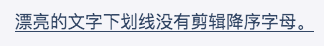
# 16.漂亮的文字强调
一个更好的替代方案text-decoration: underline或下降器不会削减下划线。本机实现,text-decoration-skip-ink: auto但它对下划线的控制较少。
<p class="pretty-text-underline">Pretty text underline without clipping descending letters.</p>
1
.pretty-text-underline {
  display: inline;
  text-shadow: 1px 1px #f5f6f9, -1px 1px #f5f6f9, -1px -1px #f5f6f9, 1px -1px #f5f6f9;
  background-image: linear-gradient(90deg, currentColor 100%, transparent 100%);
  background-position: bottom;
  background-repeat: no-repeat;
  background-size: 100% 1px;
}
.pretty-text-underline::-moz-selection {
  background-color: rgba(0, 150, 255, 0.3);
  text-shadow: none;
}
.pretty-text-underline::selection {
  background-color: rgba(0, 150, 255, 0.3);
  text-shadow: none;
}
1
2
3
4
5
6
7
8
9
10
11
12
13
14
15
16
2
3
4
5
6
7
8
9
10
11
12
13
14
15
16
效果展示
# 17.分割线
图形分割线
<div class="shape-separator"></div>
1
.shape-separator {
  position: relative;
  height: 48px;
  background: #333;
}
.shape-separator::after {
  content: '';
  background-image: url("data:image/svg+xml,%3Csvg xmlns='http://www.w3.org/2000/svg' viewBox='0 0 24 12'%3E%3Cpath d='m12 0l12 12h-24z' fill='%23fff'/%3E%3C/svg%3E");
  position: absolute;
  width: 100%;
  height: 12px;
  bottom: 0;
}
1
2
3
4
5
6
7
8
9
10
11
12
13
2
3
4
5
6
7
8
9
10
11
12
13
效果展示

信封分割线
<hr style="content: '';
    left: 0;
    right: 0;
    bottom: 0;
    background: repeating-linear-gradient(-45deg, #ff6c6c 0, #ff6c6c 20%, transparent 0, transparent 25%, #1989fa 0, #1989fa 45%, transparent 0, transparent 50%);
    height: 2px;
    background-size: 80px;" />
1
2
3
4
5
6
7
2
3
4
5
6
7
效果展示
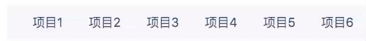
# 18.淡化非选中项
<div class="sibling-fade">
  <span>Item 1</span> <span>Item 2</span> <span>Item 3</span> <span>Item 4</span>
  <span>Item 5</span> <span>Item 6</span>
</div>
1
2
3
4
2
3
4
span {
  padding: 0 1rem;
  transition: opacity 0.2s;
}
.sibling-fade:hover span:not(:hover) {
  opacity: 0.5;
}
1
2
3
4
5
6
7
2
3
4
5
6
7
效果展示
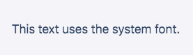
# 19.使用操作系统的本机字体
<p class="system-font-stack">This text uses the system font.</p>
1
.system-font-stack {
  font-family: -apple-system, BlinkMacSystemFont, 'Segoe UI', Roboto, Oxygen-Sans, Ubuntu,
    Cantarell, 'Helvetica Neue', Helvetica, Arial, sans-serif;
}
1
2
3
4
2
3
4
效果展示
# 20.CSS创建切换开关
<input type="checkbox" id="toggle" class="offscreen" /> <label for="toggle" class="switch"></label>
1
.switch {
  position: relative;
  display: inline-block;
  width: 40px;
  height: 20px;
  background-color: rgba(0, 0, 0, 0.25);
  border-radius: 20px;
  transition: all 0.3s;
}
.switch::after {
  content: '';
  position: absolute;
  width: 18px;
  height: 18px;
  border-radius: 18px;
  background-color: white;
  top: 1px;
  left: 1px;
  transition: all 0.3s;
}
input[type='checkbox']:checked + .switch::after {
  transform: translateX(20px);
}
input[type='checkbox']:checked + .switch {
  background-color: #7983ff;
}
.offscreen {
  position: absolute;
  left: -9999px;
}
1
2
3
4
5
6
7
8
9
10
11
12
13
14
15
16
17
18
19
20
21
22
23
24
25
26
27
28
29
30
2
3
4
5
6
7
8
9
10
11
12
13
14
15
16
17
18
19
20
21
22
23
24
25
26
27
28
29
30
效果展示

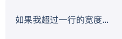
# 21.截断文本
以省略号结尾
<p class="truncate-text">If I exceed one line's width, I will be truncated.</p>
1
.truncate-text {
  overflow: hidden;
  white-space: nowrap;
  text-overflow: ellipsis;
  width: 200px;
}
1
2
3
4
5
6
2
3
4
5
6
效果展示
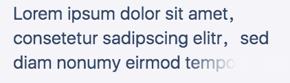
淡化结束
<p class="truncate-text-multiline">
  Lorem ipsum dolor sit amet, consetetur sadipscing elitr, sed diam nonumy eirmod tempor invidunt ut
  labore et.
</p>
1
2
3
4
2
3
4
.truncate-text-multiline {
  overflow: hidden;
  display: block;
  height: 109.2px;
  margin: 0 auto;
  font-size: 26px;
  line-height: 1.4;
  width: 400px;
  position: relative;
}
.truncate-text-multiline:after {
  content: '';
  position: absolute;
  bottom: 0;
  right: 0;
  width: 150px;
  height: 36.4px;
  background: linear-gradient(to right, rgba(0, 0, 0, 0), #f5f6f9 50%);
}
1
2
3
4
5
6
7
8
9
10
11
12
13
14
15
16
17
18
19
2
3
4
5
6
7
8
9
10
11
12
13
14
15
16
17
18
19
效果展示
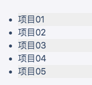
# 22.斑马条纹列表
<ul>
  <li>Item 01</li>
  <li>Item 02</li>
  <li>Item 03</li>
  <li>Item 04</li>
  <li>Item 05</li>
</ul>
1
2
3
4
5
6
7
2
3
4
5
6
7
li:nth-child(odd) {
  background-color: #eee;
}
1
2
3
2
3
效果展示
# 23.CSS抖动动画
// 动画
shake {
    transform-origin: center center;
    animation: shake 1.5s .2s ease-in-out both infinite;
}

@keyframes shake {
    0%, 100% {
        transform: rotate(0deg);
        /* 这里可以设置中心点 */
        transform-origin: 50% 0;
    }

    5% {
        transform: rotate(2deg);
    }

    10%, 20%, 30% {
        transform: rotate(-4deg);
    }

    15%, 25%, 35% {
        transform: rotate(4deg);
    }

    40% {
        transform: rotate(-2deg);
    }

    45% {
        transform: rotate(2deg);
    }

    50% {
        transform: rotate(0deg);
    }
}
1
2
3
4
5
6
7
8
9
10
11
12
13
14
15
16
17
18
19
20
21
22
23
24
25
26
27
28
29
30
31
32
33
34
35
36
37
2
3
4
5
6
7
8
9
10
11
12
13
14
15
16
17
18
19
20
21
22
23
24
25
26
27
28
29
30
31
32
33
34
35
36
37
# 24.图片放大缩小动画
.immediate-invitationd {
    position: relative;
    animation: mymove 2.5s infinite;
    animation-timing-function: ease-in-out; /* 动画的速度曲线 */
    animation-direction: alternate;/* 轮流反向播放动画。 */
}

@keyframes mymove {
    0% {
        transform: scale(1);  /* 开始为原始大小 */
    }

    25% {
        transform: scale(.9); /* 0.9倍 */
    }

    50% {
        transform: scale(1);
    }

    75% {
        transform: scale(.9);
    }
}
1
2
3
4
5
6
7
8
9
10
11
12
13
14
15
16
17
18
19
20
21
22
23
24
2
3
4
5
6
7
8
9
10
11
12
13
14
15
16
17
18
19
20
21
22
23
24